UI and UX Design Services
UI and UX design for software products and business applications, designed to be adopted, not just delivered.
This page is for teams building or redesigning an application: portals, dashboards, internal systems and customer-facing products. Good design decides whether that software gets used or quietly abandoned, so Timeline Digital researches your users, maps how they really work, and turns that into wireframes, prototypes and a design system before code is written. We design enterprise, government and consumer interfaces, including bilingual Arabic and English right-to-left systems, with accessibility built in from the first screen.
Designing a marketing website rather than an application? See UI/UX design for websites.
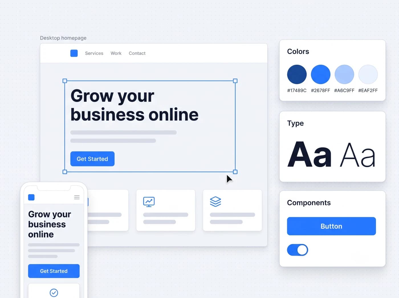
What the design work includes
- User research before any screens are drawn
- Workflows mapped to how your teams actually work
- A reusable design system, not one-off screens
- Accessibility built in to WCAG AA practices
- Bilingual Arabic and English, right-to-left ready
Why does enterprise software fail without good UX?
Most business software is not abandoned because it lacks features. It is abandoned because it is painful to use, and a system people avoid delivers none of the value it was built for.
Adoption is the real measure of enterprise software. A finished system that staff work around, complain about or quietly replace with spreadsheets has failed, however complete its feature list looks on paper. UX design exists to prevent that outcome, by shaping the software around how people actually work before it is built. These are the ways poor design turns a capable system into a stalled project.
Staff route around the system
When a screen fights the way people actually work, they find shortcuts: side channels, personal notes, a quiet return to the tool they trusted. The software is live, but the process is not really running on it.
Training load climbs
Every confusing workflow becomes a training session, a help ticket and a manager explaining the same step again. Software that needs constant explanation keeps draining time long after launch.
Errors and rework rise
Ambiguous labels, cramped forms and unclear states lead to wrong entries. The wrong entries lead to corrections, and the corrections lead to distrust of the data the system holds.
Shadow spreadsheets return
The clearest sign of a UX failure is a spreadsheet appearing next to a system that was meant to replace it. People keep the real numbers where they can see them, and the new system becomes a form to fill in afterwards.
Reporting loses trust
If entry is painful, data goes in late, partial or wrong. Leadership stops trusting the dashboards, and decisions drift back to gut feel and side conversations rather than the system of record.
The rollout stalls
A launch that meets resistance rarely recovers on its own. Adoption plateaus, the project is quietly labelled a disappointment, and the next improvement is harder to win support for. Poor UX turns capable software into a stalled project.
What does the UI and UX design process produce?
Design is a sequence of decisions, each captured in something you can review. Six stages take a project from an open question to a specification engineers can build.
- 01
User research and discovery
We learn who uses the software, what they are trying to accomplish and where the current process hurts. Interviews, observation and a review of existing systems replace guesswork with evidence before a single screen is drawn.
- 02
Workflows and information architecture
We map the tasks people perform and the paths between them, then organize screens and navigation around those real journeys rather than around the database structure. This is where most usability problems are prevented or created.
- 03
Wireframes and structure
Low-fidelity layouts settle what goes where and in what order, without color or styling to distract from the structure. They are quick to change, so we resolve disagreements on paper instead of in code.
- 04
Interactive prototypes
Key flows become clickable prototypes your team and real users can try. People react to something they can use far more usefully than to a static picture, and problems surface while they are still quick to fix.
- 05
Visual design system
Once the structure is right, we apply a consistent visual language: type scale, color, spacing, icons and reusable components. This becomes the design system your product is built from and extended with over time.
- 06
Developer handoff
Designers hand engineers specifications, assets, states and component definitions, not just a flat picture. Because our designers and developers work in the same organization, questions are answered directly rather than lost in a document.
What changes when software is designed before it is built?
Design is not a coat of paint applied at the end. The difference between designing first and building first shows up in adoption, training, errors and the effort behind every change.
| Aspect | Designed before it is built | Built without a design phase |
|---|---|---|
| First-day adoption | Screens match how people already work, so uptake is faster | Users push back on a system that fights their habits |
| Training effort | Clear workflows need less explanation and fewer sessions | Every confusing step becomes recurring support and training |
| Error and rework rate | Well-labelled forms and clear states reduce wrong entries | Ambiguity produces mistakes, corrections and distrust of data |
| Effort of change | Problems are found on wireframes and prototypes, quickly | Problems are found in built software, with rework |
| Consistency | A design system keeps new screens coherent as the product grows | Each new screen is designed from scratch and drifts apart |
| Accessibility | WCAG AA practices are built in from the first layout | Accessibility is retrofitted late, if at all |
| Bilingual support | Right-to-left and dual-language handled in the structure | Arabic support bolted on breaks layouts and reading order |
How does design affect adoption inside an organization?
Inside a company, the impact of a design decision is multiplied by every employee who lives with it. Small usability choices become large numbers once hundreds of people use the same screen daily.
Consumer software competes for attention; internal software competes with the habits of people who did not choose it. That makes adoption harder, not easier, because your staff cannot simply leave, they can only comply reluctantly or resist. Design that lowers the effort of doing the job is what turns a mandated tool into one people are willing to use. Three effects decide whether that happens.
Training time
The more a design mirrors the mental model users already hold, the less time goes into teaching it. We reduce the number of things a person has to be told before they can work, which cuts onboarding time for every new employee for years.
Error rates
Most operational errors are design problems wearing a human disguise. Clear grouping, sensible defaults, inline validation and honest empty and error states catch mistakes at the point of entry instead of at month-end reconciliation.
Change resistance
People resist tools that make their day harder, not tools that make it easier. Involving real users during research and prototyping turns them from objectors into people who helped shape the result, which is the strongest adoption lever there is.
How do you design bilingual and right-to-left interfaces?
Supporting Arabic and English is a structural decision, not a translation step. A right-to-left interface is a mirror of the whole screen, and it has to be planned in the design rather than added afterwards.
When a product serves users in Arabic and English, we design both from the start so neither language feels like an afterthought. Layouts, navigation and reading order flip cleanly for right-to-left, mixed Arabic and Latin text stays in the correct order, and reports carry both languages where they need to appear together. Our delivery experience includes a public-sector program in Qatar where bilingual Arabic and English interfaces were part of the requirement. These are the areas we settle in the design rather than leaving to chance.
Mirrored layouts
Navigation, controls and reading order flip for right-to-left, so an Arabic screen is a proper mirror of the English one, not English text pushed to the right.
Bidirectional text
Arabic sentences that contain Latin names, codes or numbers are handled so mixed content reads in the correct direction without characters jumping out of order.
Numerals, dates and currency
We agree how numerals, Hijri or Gregorian dates and currency formatting behave in each language, because the right choice depends on your users and their documents.
Bilingual typography
Arabic and Latin scripts have different rhythms and heights. We choose type and spacing that keep both languages readable rather than tuning one and tolerating the other.
Forms and data entry
Labels, placeholders, validation messages and keyboard behavior are designed for both languages, so entering data in Arabic is as comfortable as entering it in English.
Reports and printing
Printed and exported documents often need both languages together. We design tables and reports that stay aligned and legible when Arabic and English sit side by side.
What accessibility standards do you follow?
We design to WCAG AA practices, built in from the first wireframe. We describe them as practices honestly, because a practice is not the same as a formal certification.
Accessible design widens who can use your software, from staff working by keyboard instead of a mouse to members of the public with visual or motor differences. We build these considerations into every layout rather than bolting them on at the end, where they are harder to get right and less effective. To be clear about what this is: these are design and build practices aimed at WCAG AA, not an accessibility certificate. If your project needs an independent audit or a compliance sign-off, we design to that target and work alongside the auditor you choose, and the certificate comes from that third party.
Color and contrast
Text and interface colors are chosen to meet WCAG AA contrast, and meaning is never carried by color alone, so status stays readable for color-blind users.
Keyboard operation
Every control can be reached and used from the keyboard, in a logical order, for people who do not use a mouse or who rely on assistive input.
Screen reader structure
Headings, labels and landmarks are structured so screen readers can describe the page sensibly rather than reading a wall of unlabelled controls.
Visible focus
The element in focus is always clearly indicated, so keyboard users can see where they are instead of guessing.
Forms and error messages
Fields are labelled, required inputs are marked, and errors are explained in plain words tied to the field they belong to.
Motion and timing
Animation is kept purposeful and respects a reduced-motion preference, and nothing critical depends on a movement a user cannot pause.
Can you redesign existing software without rebuilding it?
Often, yes. A tired or confusing interface can be improved in stages, and a full rewrite is not the only route to software people are glad to use.
We begin with a design audit of the current application: where users struggle, where the visual language has drifted, and what the underlying system will and will not allow. From there we plan a redesign that fits your reality, whether that means restyling the front end, reworking the most painful screens first, or putting a consistent design system over an application that grew feature by feature. Where the architecture genuinely limits what the interface can do, we say so plainly and set out the trade-offs, so the choice of how far to go stays yours.
If a rebuild is the right call, the same design work feeds directly into it, and our legacy software modernization service covers that path.
- Your application works but looks dated, and the interface is hurting your credibility with clients or new users.
- Support tickets and training time point to the same few screens, and you want those fixed without a full rebuild.
- You have grown feature by feature, and the product now feels inconsistent because each part was designed on its own.
- You need to add accessibility or an Arabic interface to software that was never designed for either.
- You want a design system put over an existing codebase so future work stays consistent instead of drifting.
What affects a UI and UX design timeline?
Every project is custom, so we do not publish generic durations. These are the factors that genuinely move the schedule, what we need from your team, and the risks we manage.
What stretches or shortens the timeline
- The number of distinct screens and user roles in scope
- How much user research and testing you want built in
- One language or a bilingual, right-to-left interface
- Whether a design system already exists or must be created
- Speed of feedback and sign-off from your side
What we need from your team
- One decision-maker who can approve direction and unblock design
- Access to real users, or the people who understand them
- The current system, or examples of the workflows involved
- Your brand assets, or agreement to define them with us
- Timely feedback on wireframes and prototypes
Risks we manage explicitly
- Design decided by internal opinion instead of user evidence
- Attractive screens that ignore how the work is actually done
- Accessibility and Arabic support left until it is hard to add
- A design that engineering cannot build as drawn
- Scope quietly expanding without a matching timeline
After a short conversation about your product and its users, we put scope, stages and the plan in writing before any work begins. Discuss your software requirements with Timeline Digital.
What does Timeline Digital bring to design work?
Design is strongest when it sits next to the people who build the software. Our designers and engineers work in the same organization, so a design is checked against what can actually be built.
1,200+
Developers
As direct and group-company employees
1,500+
Projects delivered
Across software, web and mobile
860+
Active clients
In 25+ countries
85+
Management professionals
Project managers, analysts and QA leads
Timeline Digital has been designing and building business software since 2013. Our delivery experience spans enterprise, government and consumer interfaces, including a public-sector program in Qatar with bilingual Arabic and English requirements. You can review documented projects on our case studies page before you talk to us.
UI and UX Design Questions, Answered
When design happens, what a design system is, redesigns, accessibility, usability testing and bilingual interfaces.
The core of UI and UX design happens before development, and lighter design support continues during it. Research, workflow mapping, wireframes and prototypes come first, because their whole value is catching problems while they are still quick to fix on paper rather than in built software. Once the visual design system and screens are approved, design shifts into a supporting role, answering questions, refining edge cases and reviewing what engineering builds. Designing the product up front and then keeping designers involved through the build gives you both a considered plan and a result that matches it.
A design system is a reusable library of the parts your interface is built from: type scale, colors, spacing, icons, buttons, forms, tables and the rules for how they combine. It replaces one-off screen design with a consistent kit, so every new screen looks and behaves like the rest of the product and takes less time to build. For a growing application this matters more than any single screen, because it keeps the product coherent as different people add to it over months and years. We deliver the system as documented components that your engineers build against directly.
Yes, in many cases the interface can be redesigned without rebuilding the underlying system. We start with a design audit of the current application, then plan a redesign that fits your codebase: restyling the front end, reworking the most painful screens first, or layering a new design system over what exists. This lets you improve usability and appearance in stages rather than through one risky rewrite. Where the architecture genuinely limits what the interface can do, we say so and describe the trade-offs honestly, so you can decide how far to take it.
We design to WCAG AA practices: sufficient color contrast, full keyboard operation, sensible structure for screen readers, visible focus, clearly labelled forms and readable error messages. These practices are built in from the first wireframe rather than retrofitted at the end. To be clear, this is a set of design and build practices, not a formal accessibility certification or a legal guarantee. If your project needs an independent accessibility audit or a compliance sign-off for a specific standard, we can design to that target and work alongside the auditor you choose, but the certificate itself comes from that third party.
We test usability by putting prototypes in front of real users and watching what they do. Rather than asking whether people like a design, we give them realistic tasks and observe where they hesitate, misread a label or take a wrong path. Those observations point directly to what needs to change. Testing happens early on clickable prototypes, when fixes are quick, and can continue after launch to confirm the changes worked. Even a small number of participants surfaces most of the serious problems, so this stays practical to run without a large research programme.
Yes. We design interfaces that work in both Arabic and English, including full right-to-left layouts where the whole screen mirrors rather than English text simply pushed to the right. This covers mirrored navigation, bidirectional text where Arabic and Latin characters mix, numerals and date handling, bilingual typography, and reports that carry both languages together. Our delivery experience includes a public-sector program in Qatar alongside commercial work. Bilingual and right-to-left support is handled in the structure of the design from the start, because adding it to a finished single-language interface tends to break layouts and reading order.
To start we need one person who can make decisions and give feedback, access to real users or the people who understand their work, and a clear picture of the workflows the software supports. If you have an existing system, brand assets or examples of tools your users like, those help us move faster. If you do not have brand guidelines, we can define the visual direction with you as part of the work. The single most valuable thing you provide is honest access to how the job is really done today, including the informal steps people rarely write down.
Yes. We design mobile app interfaces as well as web and desktop software, and we design for the platform rather than shrinking a desktop screen onto a phone. That means respecting touch targets, native navigation patterns, offline and connectivity states, and the smaller space a phone offers. The same process applies: research, workflows, wireframes, prototypes and a design system, adapted to mobile. Where a product spans phone, tablet and desktop, we design a consistent experience across all of them from one design system, so the product feels like one thing on every screen.
Related design resources
Branding and Graphic Design
Logos, brand identity and visual assets that sit behind your interface design.
Read this nextWebsite Design and Development
Marketing sites and web platforms designed and built end to end.
Read this nextQatar Government Digital Platform
A public-sector program in Qatar with bilingual Arabic and English interfaces.
Read this nextStart a conversation
Tell us how your business works.
Describe what is slowing your team down. We will help you work out what to build, and how a free pilot lets you judge our work before the full project.
Prefer WhatsApp? Start a chatWhat happens next
You send a short brief
The problem, the people involved and any target date. A senior engineer replies within 4 business hours.
We understand your workflow
A first call about how your business works today. An NDA can be signed before you share details.
You test a free pilot
You choose 2 to 3 key modules and we build them first, so you judge real software before the full project.